OUR PREDICTION OF PANTONE’S COLOUR OF THE YEAR 2027
At Handmade Luxury Home, Marga and I spend a lot of time talking about colour. Luckily, we do not replicate the passionate discussions of the 19th century great thinkers, monochrome lovers, and colour devotees who had a go at each other’s preferences. Colour -according to devoted monochromists- was vulgar. Monochrome art -said the colourists- was obscuring design.
It seems a bit of an unnecessary discussion now, but it was not. The discussion of ‘to use or not to use colour’ was a question about the essence of art and design: is it form or colour? This is an important question and its answer now -in our time- seem to be a syntheses of both camps: form and colour harmoniously put together make great art and design.
Marga and I love colour but we are sensitive to changing preferences. We follow colour developments eagerly, like the Pantone Colour of the Year.
Let me explain
The Pantone Colour of the Year is an annual tradition established by the Pantone Colour Institute in 2000, designed to reflect global cultural, social, and political climates. Each year, a single color (or occasionally a pair) is selected after extensive research and analysis by Pantone’s team of colour experts. The colour experts consult interdisciplinary experts like sociologists, psychologists, designers, fashion houses, and futurologists, those who have sensitive antennae.
The process involves examining trends in design, fashion, art, and even technology, as well as considering broader societal themes and emotions. The chosen colour is intended to capture the spirit of the times, offering a symbolic snapshot of what the world is experiencing and aspiring toward.
In that sense, the Colour of the Year, is rather fascinating.
The proclamation of the Colour of the Year matters because it influences industries far beyond design—from fashion and beauty to product development and marketing. Brands often align their collections and campaigns with the chosen hue, leveraging its cultural resonance to connect with consumers. Like, Marga and I have taken great care adding Pantone’s 2026 Colour of the Year -Cloud Dancer- to our website.
CLOUD DANCER
Cloud Dancer was announced as Pantone’s Colour of the Year for 2026. This soft, airy white shade with a hint of greyish undertone gives us a sense of lightness, serenity, and ethereal beauty—much like the fleeting, dreamy quality of clouds dancing across the sky. The colour reflects a growing cultural desire for tranquility, mindfulness, and connection to nature, especially in an increasingly fast-paced and digital world. It’s a hue that encourages calmness and introspection, making it a fitting choice for a year likely to emphasize balance and emotional well-being.
I have to admit that Cloud Dancer came as a surprise to me. Because off white is hardly seen as a colour. It is mostly used as a highlight. That said, a blank canvas or drawing pad often has the off white colour of Cloud Dancer, thus I am highly appreciative to that colour as a fine artist. It didn’t took long for Marga and I loved Cloud Dancer.
BLANK CANVAS
In a sense the 19th century passionate monochrome movement and devoted colourists would both feel happy with Cloud Dancer. Cloud Dancer isn’t so much a bold colour: it is a bold choice! Like I said, most artists sketch on off-white paper or canvases, and seamstresses make their first fitting with off-white paper. Clay is often off white- grey, and any artists starting an oil painting will first make a charcoal sketch on ‘Cloud Dancer- blank canvas, after which layers of colour will be added.
HOW ABOUT MOVING AWAY FROM CLOUD DANCER?
We feel a bit sorry for Pantone having to find the Colour of the Year 2027! Cloud Dancer is so deliciously harmonious (it even unites the monochrome lovers and hue devotees)—how can they announce a return to real colour?
Marga and I predict that whatever colour is chosen, it will provoke strong reactions and perhaps even reignite the debates between the colour minimalist and the colour maximalists.
We therefore think that Pantone might opt for a soft colour. It will move—it has to!—away from Cloud Dancer, but not too far. (We actually think it would be perfectly fine to have a double year of Cloud Dancer.)
COLOUR OF THE YEAR 2027?
We are now halfway 2026 and we are fully enjoying Cloud Dancer. Dare we to predict Pantone’s Colour of the Year 2027?
Yes!
Here are our predictions.
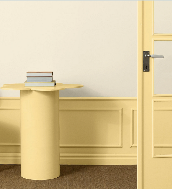
Naples Yellow
A warm, deep yellow with a slightly earthy, ocher and sandy undertone, reminiscent of the golden hues of Italian sunlight.
Why? Because we love the neutral and lightness of Cloud Dancer but we understand the need to move forward and by mixing in a bit of sandy and earthy quality, we get Naples Yellow. Naples yellow is sweet and positive. We need a lot of sweetness and positiveness in this world full of geopolitical tensions.
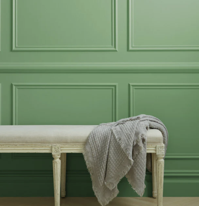
Matcha Green
A rich, muted green that sits between sage and olive. Unlike bright or neon greens, Matcha Green is subdued yet vibrant, with a natural, organic feel.
Why? Because matcha is storming the world of brews with its unique combination of health benefits and cultural appeal. Its versatility—used in lattes, smoothies, desserts, and cakes —has made it a staple in cafés worldwide. Matcha mania does no show any signs of slowing down.
Cool Blue
A pale, cool blue with a frosty, almost translucent quality, like the surface of a glacier.
Why? Because we had such hard time biting ourselves through the heatwaves of May and June 2026. Code Red was given first time ever in the Netherlands. We texted in June to each other ‘Give me winter now!’ We are too Nordic genetically, we need Cool Blue, it is that simple.
For the element of surprise, we would love our predictions being wrong. As long as Pantone doesn't come up with Ivory Black. :-)
Paula Kuitenbrouwer
Marga van der Vet

Comforting, sandy Naples Yellow. Even de name is lovely.

Matcha Green. We love it because we love matcha and we love green.
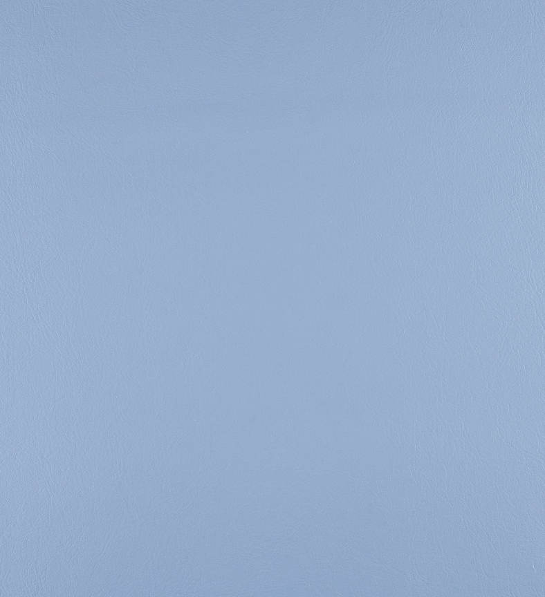
Cool Blue...because we have been cooked by summer 2026.

What is your prediction of Pantone's Colour of the Year 2027?
And why?
We love to hear from you and we might add your ideas to this blog (if you give us permission).
-
 Caribbean Blue Cotton Quilt € 135,00


Reactie plaatsen
Reacties